- Home
- Portfolio Item
- Kaus insurance
About: Kaus is an insurance company with over 30 years of experience selling insurance in the B2B market. They feel confident in offering bundled packages and providing excellent customer service. Kaus believes those two components give them an edge in the market. However, to stay current with competitors Kaus is changing their business strategy to serve the B2C market. With a fresh look and new digital products, Kaus is looking to the future to ensure their customers are satisfied.
Relevance: Let us break the status quo regarding big businesses, like insurance companies. While it’s a must-have, it’s not necessary for the process to be confusing and misleading. Insurance should not only protect you, but the process should be one that makes you smile. Not only should the product help you as the customer, but it should also look relevant to the world we live in. In the age of highly curated everything, why wouldn’t that apply to an insurance company? The pairing of a fun and functional design and excellent customer service should exist for all users.
Case study timing: 6 weeks
Role: UX/UI Designer, Researcher
Tools: FIGMA, MIRO, OW
Problem
Kaus is looking to shake things up by re-structuring their business model. They want to start selling directly to the consumers, or B2C market. To make this shift successful, Kaus is aiming to attract a younger demographic by creating a current website that emphasizes bundled package deals and exceptional customer service. One of the main reasons Kaus is making this shift is to appeal to a new market. By targeting younger consumers, Kaus hopes to increase their exposure and ideally, enjoy larger sales volume and business longevity. They believe that by creating a modern, user-friendly website and offering exceptional customer service, they can win over consumers.
Project Goal
My goal is to create an intuitive design that meets the needs and desires of our target audience from our design brief. I will rely on user testing to guide our design decisions and ensure that the website is both user-friendly and aesthetically appealing.
Solution
Design a Responsive Website! To accomplish this, I will conduct user interviews to gain insight into user behavior and preferences. This feedback will inform our market research, in which we will analyze trends and competitor strategies to identify opportunities for differentiation.
Without understanding, I can’t see beyond the problem to the other side that potentially holds the solution. Seek understanding by asking questions.
The approach to start with competitive analysis laid the framework to better understand who my direct competitors were in the insurance industry and what their strengths and weaknesses are. I could quickly see a gap in the market that our client offerings could fill.

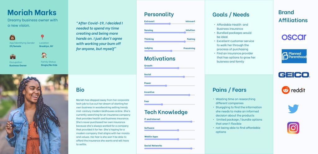
My user persona funneled all the information from my competitive analysis and user interview responses by generating a user persona that I felt would be the best candidate to create a prototype for. The persona helped guide the project forward during the design and testing phases. Continually cross-referencing this document ensures my design meets the parameters for our outlined project brief.
Based on my user interviews I know two important findings, one the user’s motivations and two the user’s needs. This information is pivotal to creating the user persona and for the project at large. (see finding below)
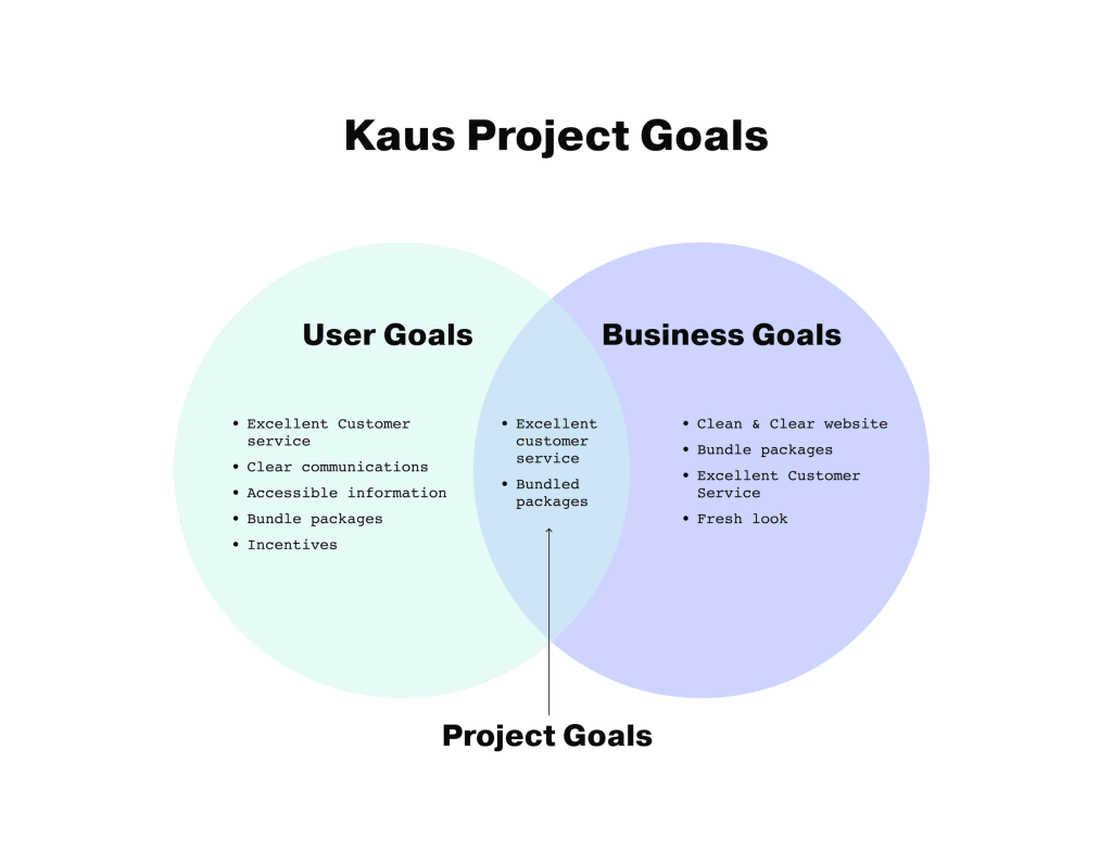
Design thinking has been created to always circle back. This step, the project goals Venn diagram, helped me hone in on where the project is going. The goals act as a guide to ensure that as the phases of the project move forward I stay on track.
The design brief tasks us to generate both structural and visual solutions within the confines of a responsive website. The diagram clearly states that both, the users and Kaus are looking for excellent customer service. Users and Kaus also align on the desire to have bundled packages.
As long as the design and prototype fulfill these two requests, both the user and Kaus will be happy.
It’s time to get organized.
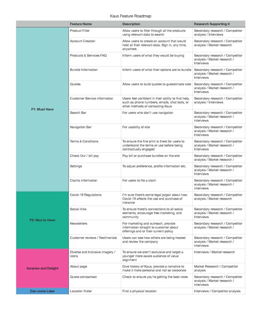
The feature roadmap is the best way to move from the above goals to the logistical aspect of the project. Here I set out to rapid-fire all the possible attributes of the product. Additionally, it’s important to see where I got this information, such as competitor analysis, interviews, etc. The information can help me weigh out what becomes a priority or not.
From navigation items to projected possibilities of the product, this chart takes all those ideas, hopes, and dreams and breaks them down into four categories in this case. Our priority items are all elements that we have to have, like navigation. By prioritizing the elements not only can I build out the back end of the project, and the timeline, but I can ensure I have all the elements I need, want, and hope to have in the future.
Designing this site map is the visual representation of the card sorting exercise. It laid the groundwork for building the site map. Here you can see the navigation will have multiple pages within each category.

I added a portion of my persona to the side of my task flow as a reminder that the task flow requirements are to hit the needs and motivations of my persona. Moriah, my user persona, was looking to work with an insurance company that provides excellent customer service. She wasn’t confident about making big decisions with her insurance. She also wanted to be sure she could bundle her insurance needs to get the best quote possible.

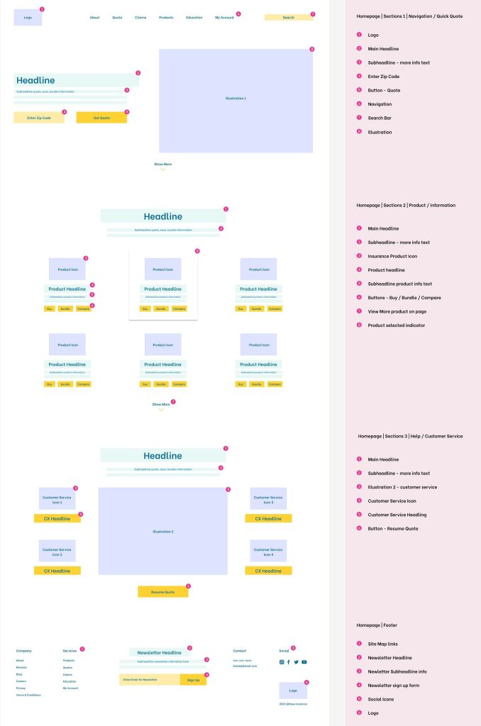
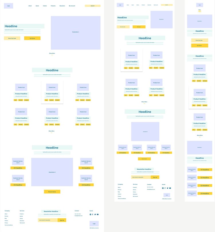
I built my lo-fi wireframes with paper and pencil, starting with the desktop version. To be sure I had all the components I needed I clearly labeled each element. I then digitized my sketch.
A responsive design is critical to meeting the design brief, knowing that I designed sections that were comprised of cards that would easily transform based on the device. This proved to be a very efficient way of organizing the content.
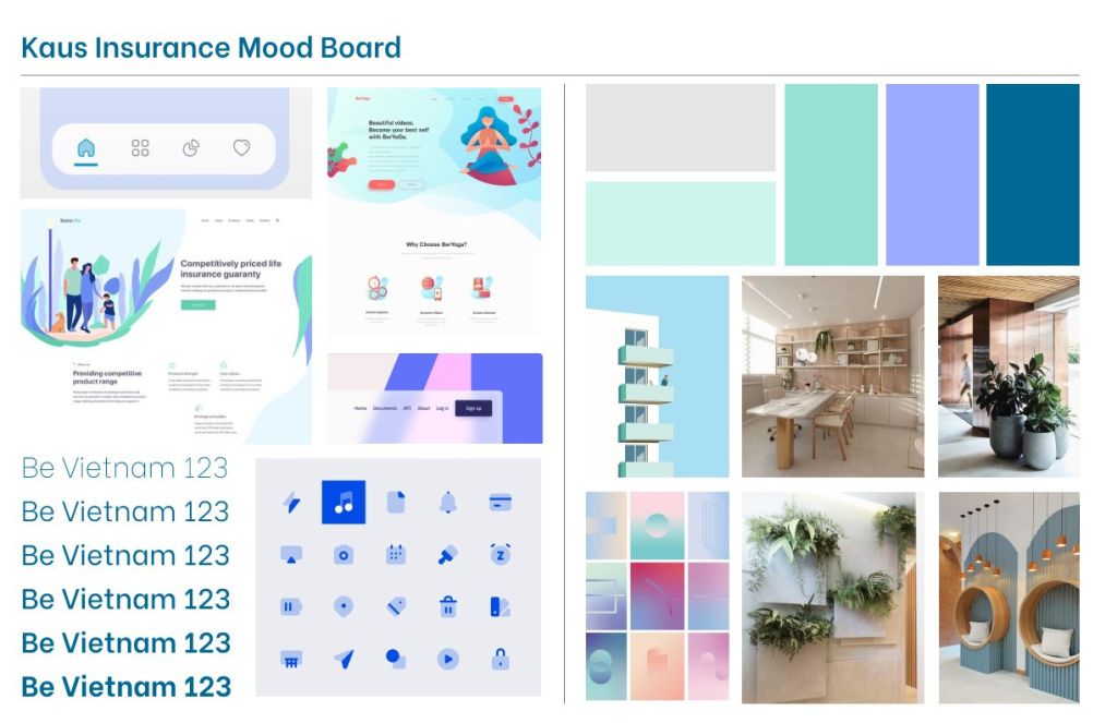
When collecting images for my mood board I was very intentional about taping into the 5 senses to guide me. While some of the senses didn’t apply, sight, touch, and smell all led me to think of fresh, clean, and healthy.
I added images of interior spaces because I thought it was important to think about this product as an office that a user walks into. I wanted to depict the vibe I wanted my users to feel, which was trust and mental health.
Fresh colors such as blues and purples felt young and vibrant. The iconography should look youthful but solid because insurance is a real adult decision, but it doesn’t have to look utilitarian and stuffy. A clean San serif typeface seemed fresh, but also accessible to all users.
I always start my logo design process with paper and pencil. I get all the wacky ideas out and then expand on the few that are the most applicable. I digitized and kept tweaking until the final version formed.
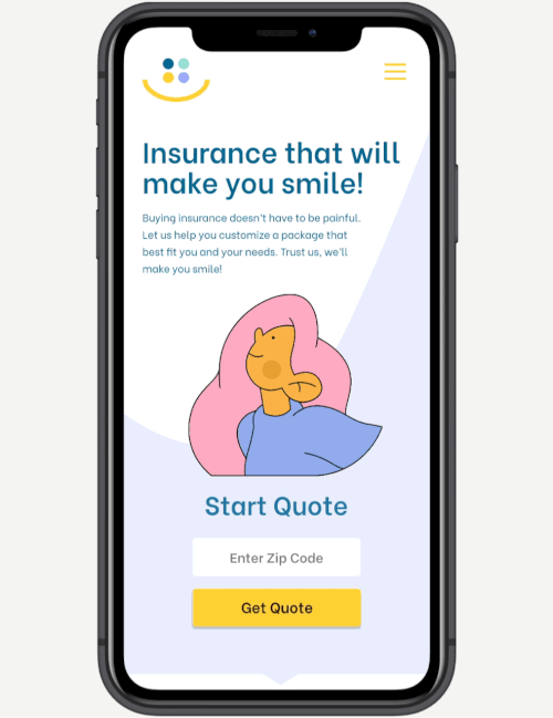
This logo is inspired by my user interviews. A user said going through the research and purchasing of insurance is the worst thing, but a necessary evil. I reversed this notion and came up with the tagline “Insurance that will make you smile.” The logo is based on a smile.
When it comes to color I work in black and white first. My design education taught me that if it can’t hold in black and white, then it can’t hold in color. As I added the colors from my mood board they jived together to make it feel good and fresh. I also pictured each color representing a type of insurance sold at Kaus. the use of yellow is known to invoke happiness, so yellow it was, and it worked.

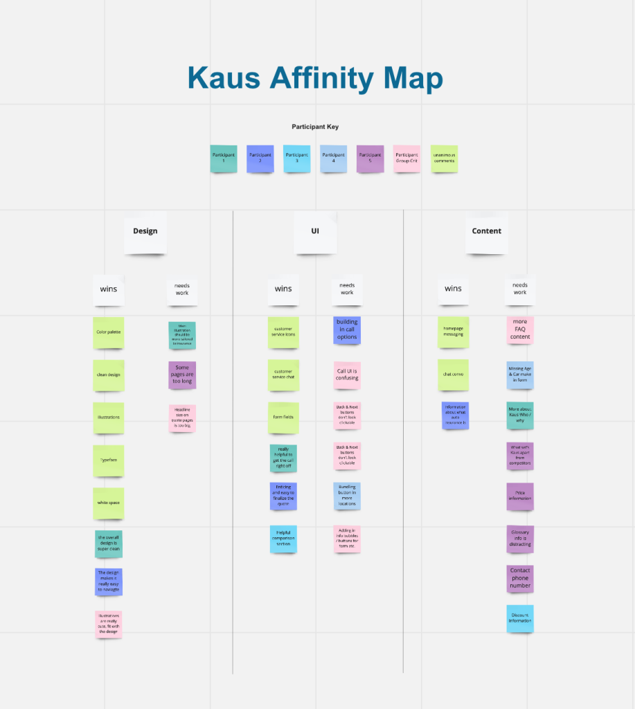
The affinity map is organized into three categories; design, UI, and content. These were the three categories that laid the foundation of my interview questions.
I made an executive decision to add the comments from a group critique after they reviewed my usability test prototype. I then added a sticky note color where the interview responses and the group critique responses were unanimous. The feedback was sound and shaped my next phase, priority revisions.